

Visit our website today!
Claim your promo code!
Read more here.
What do these statements all have in common? Easy: they’re all calls to action.
A critical part of marketing, the call-to-action, or CTA, tells your readers what to do next, provides direction, and helps you drive the outcomes you want from in marketing. In fact, the CTA might just be the most important sentence you ever write.
How the CTA Works
The CTA runs from a business to its users. At its most basic level, the CTA is an appeal to readers. It invites them to respond, to take action, and to interact on a deeper level with your brand.
A good CTA is a conversion tool. Conversion, in the world of marketing, is getting someone to take action. Depending on your marketing goal, a successful conversion could mean getting someone to download your ebook, having a reader submit their email address, or convincing that on-the-fence customer to make their first purchase. In most cases, the CTA is a clickable button with text.
If you want to boost your conversions, the first thing you should do is focus on your calls-to-action. While they come in many different shapes and sizes, CTAs can be adjusted to suit your needs, and will help facilitate virtually any action you want your readers to take.
Common Types of CTAs
Wondering what the CTA looks like in its natural environment? Here are some of the most common types of CTAs:
- “Add to Cart” buttons
- “Subscribe” forms that gather customer information
- “Read More”
- “Try/Buy it Now”
- Widgets and social sharing buttons
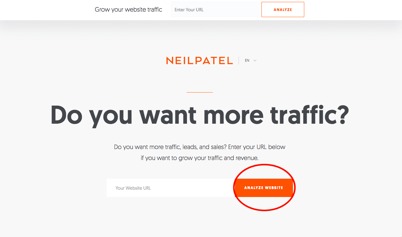
Online chat and “Help” buttons even count as CTAs! As you make your way around the web, you’ll see that different companies all use CTAs in different ways. Here are some examples of what the CTA looks like on a few modern websites:


The Features of a Good CTA
CTAs aren’t random or accidental. In fact, each has a unique set of factors that determine its success or failure. There are three main features to every CTA on the web:
- Design
- Placement
- Copy
These three things come together to determine how successful a CTA is and how well it works to convert customers. A CTA will be more fruitful if a customer can spot it easily, understand immediately what they’re supposed to do, and take the required action without too much trouble.
All this brings us to one major question: how do you design a high-converting CTA that’s ideal for your business?
Putting Your CTA in the Right Place
First things first, customers have to be able to see your CTA. This means you have to place it in the right section on your website or landing page. Follow these guidelines as you place your CTAs:
- Create a Variety of CTAs. One CTA won’t produce the results you want. Instead, you’ve got to create a selection of CTAs and place several of them on each page of your site. The reason for this is simple: when customers have more opportunities to convert, the chances that they will go way up. Just remember that your CTAs shouldn’t compete with one another, and should not be confusing or difficult to use. Don’t tangle your readers up with too many options or create CTAs that compete with one another. As long as your CTAs are all pointing to the same place, your users will be happy to bite.
- Use CTAs on Every Page. There should be a CTA on every page of your website. By giving readers a chance to convert everywhere they are, you’ll boost your ROI.
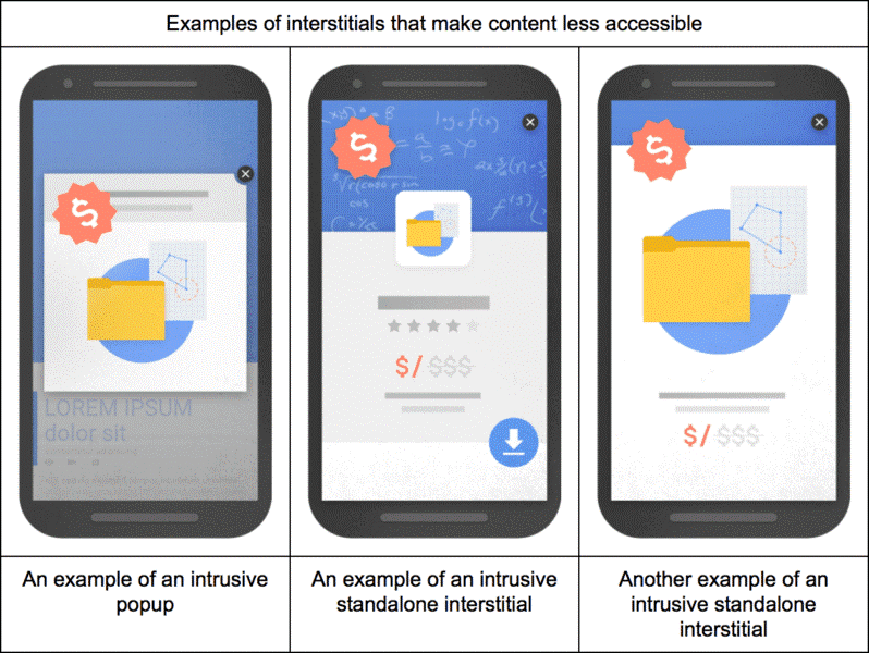
- Make CTAs as Prominent as Possible. CTAs should be prominent and easy to find. As you place your CTAs, keep in mind how users will view your page. Eye-tracking studies have found that readers scan web pages in an F-shape. With this in mind, put your CTAs in an obvious place, like a banner at the top of the page, or a box on the right-hand side of the page. Whatever you do, remember that Google unleashed an Intrusive Interstitial Update last year, which punishes any interstitial that makes content less accessible.
Designing Your CTAs
There are dozens of ways to design a great CTA, and none are necessarily “right” for your business. Instead, you’ll need to consider your overall brand, your mission, and your customer base as you set out to design your CTA. As a general rule, you should consider the following factors as you create your CTA buttons:
- Branding. Your CTAs should all be recognizable and on-brand. In addition to ensuring it looks like a button that people should click, your CTA should also obviously belong to your brand. This means keeping your logo, colors, and voice consistent to avoid throwing your readers off.
- Clarity. CTAs work best when they’re clear and explicit and easy for your readers to understand. Keep your copy concise and compelling, and your design simple enough that it doesn’t compete with the purpose of the CTA.
- Negative Space. Good CTAs feature intelligent negative space. By leaving enough white space around your CTAs, you set the button apart from the rest of the website and make the CTA more obvious for your users.
Writing Your CTAs
The final step of creating a good CTA is to write the copy needed. This is also the hardest part. While CTAs perform better when they include a photo or a video, you can’t get out of using words altogether.
After all, prospects still have to make up their mind about how they feel regarding your brand, and good CTA copy is what helps them do this. To be as effective as possible, the text on your CTA must check the following boxes:
- It must be clear. Again, readers should know exactly what they’re supposed to be doing. If your CTA produces any confusion, they won’t click on it. Every CTA you write should make it clear what the reader will get and what they have to do to receive it. There should be no hints, no secrets, and no subtlety.
- The voice should be active. Whenever possible, use active voice in your CTAs. Active voice is stronger and more compelling than passive voice, and will help your readers get into the active mindset they need to take action. This said, use action verbs like the following to beef up your CTAs: order, subscribe, get, learn, discover, buy, etc.
- It must communicate value. With any CTA you post, you’re asking your readers for something. The thing is, they have to want to give it to you. And why should this be true? What are you giving them in return? What do you have to offer that’s valuable enough to make them take the leap? If they’re going to work, your CTAs have to communicate value to your customers. As you write your CTAs, try to see them from the customer’s perspective. Would that offer make you click? Is that enticing enough to get you to take notice? What’s in it for them?
- It should be trustworthy. Readers need to feel a sense of trust and assurance in your company to click your CTAs. Things like “no spam,” “unsubscribe at any time,” and “no credit card required” demonstrate that you’re providing value for your customers without putting them in a situation they’re uncomfortable with.
- It should grab attention. According to Business Insider, you only have about seven seconds to make a first impression. This matters when you start to consider your CTA copy. If it doesn’t grab reader attention, you’re going to miss out on the conversions you deserve. When it’s finished, your CTA should be visible, compelling, and exciting. Feel free to add some humor or personality, if it aligns with your brand.
The Power of the CTA
The CTA: it’s one of the most important tools in your marketing quiver and understanding how to use it correctly is essential to producing the conversions you want. Whether you’re creating a landing page for a campaign, driving awareness about an event, or starting a new business, a great CTA can make all the difference between success and failure. By using these tips to overhaul your CTAs, you can enjoy increased conversions, more engaged customers, and a smoother and more streamlined sales process, from start to finish.